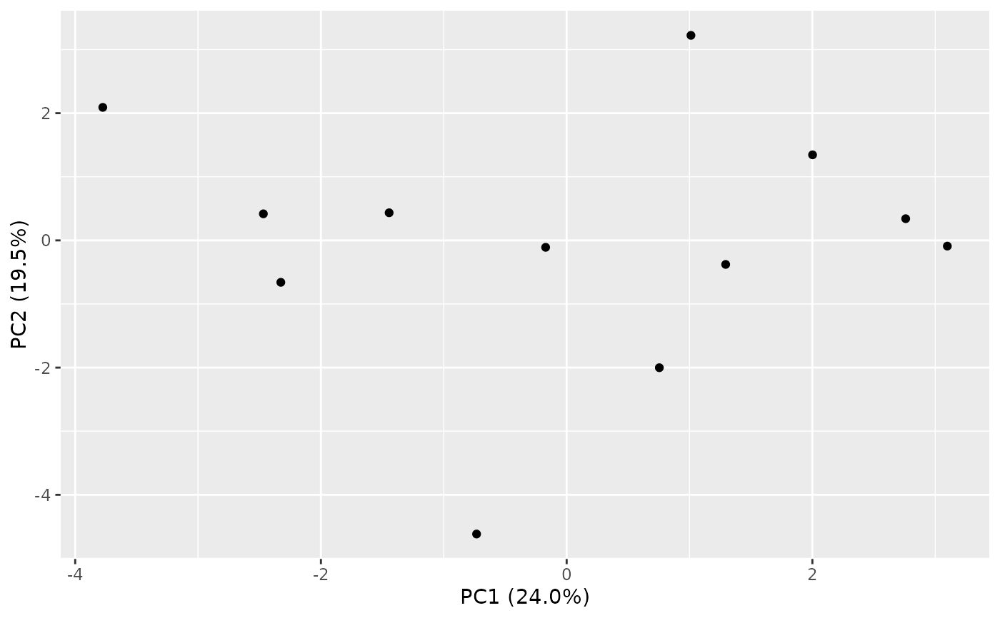
Produces a ggplot2 scatter plot of two principal component score
axes, optionally colored by a sample-metadata column. This is a purely
visual convenience: the statistical results returned by
pca_audit do not depend on this function being called.
plot_pca_audit(pca_result, pc_x = 1, pc_y = 2, color_by = NULL)Arguments
- pca_result
An object of class
"rnaSentry_pca"as returned bypca_audit.- pc_x, pc_y
Integers selecting the two PC axes to plot. Defaults to
1and2.- color_by
Optional character. Name of a sample-metadata column in the original
colData(se)to color points by.
Value
A ggplot object.
Examples
library(SummarizedExperiment)
set.seed(2)
counts <- matrix(rpois(240, lambda = 200), nrow = 20, ncol = 12,
                  dimnames = list(paste0("gene", 1:20), paste0("S", 1:12)))
coldata <- DataFrame(batch = factor(rep(c("B1", "B2"), each = 6)),
                      row.names = paste0("S", 1:12))
se <- SummarizedExperiment(assays = list(counts = counts), colData = coldata)
res <- pca_audit(se, batch_col = "batch")
plot_pca_audit(res)